It started with a word I didn’t know.
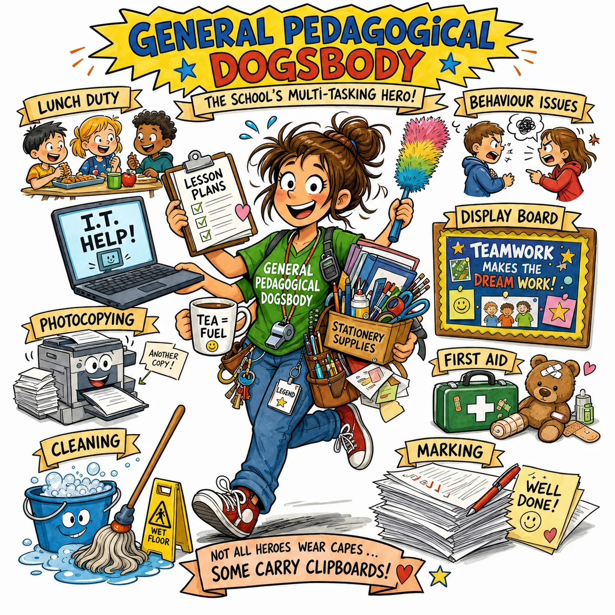
A colleague shared something in our Teams channel, a funny image captioned “General Pedagogical Dogsbody.” I got “General” and “Pedagogical” well enough, but Dogsbody? No idea. Instead of asking in the thread, I quietly looked it up in ChatGPT.
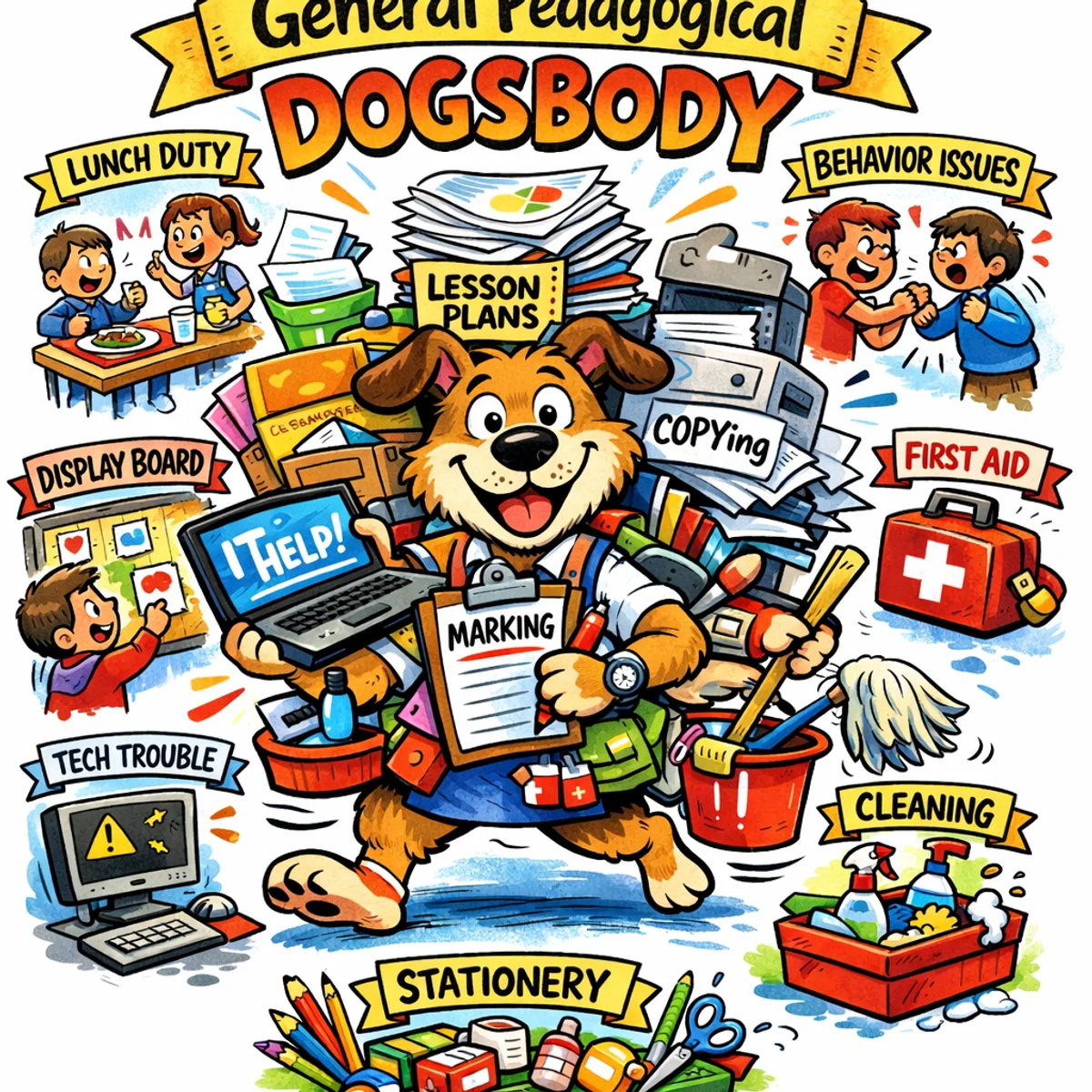
Turns out it’s a British slang term for someone who gets landed with every odd job nobody else wants. A teaching assistant, essentially, juggling admin work, classroom management, and everything else, often without much recognition.
The image suddenly made a lot more sense. And it got me thinking.
From Slang to Experiment
The original image had a particular style. Hand-drawn, busy, the kind of thing you’d pin on a staffroom noticeboard and actually stop to read. I was pretty sure it was AI-generated.
I’d been wanting to dig into AI image generation properly for a while. I’d seen results from Google Gemini and the GPT image models that caught my attention, but hadn’t had a reason to sit down and actually push them.
This felt like a reason. So I started pulling at the thread.
Building the Prompt
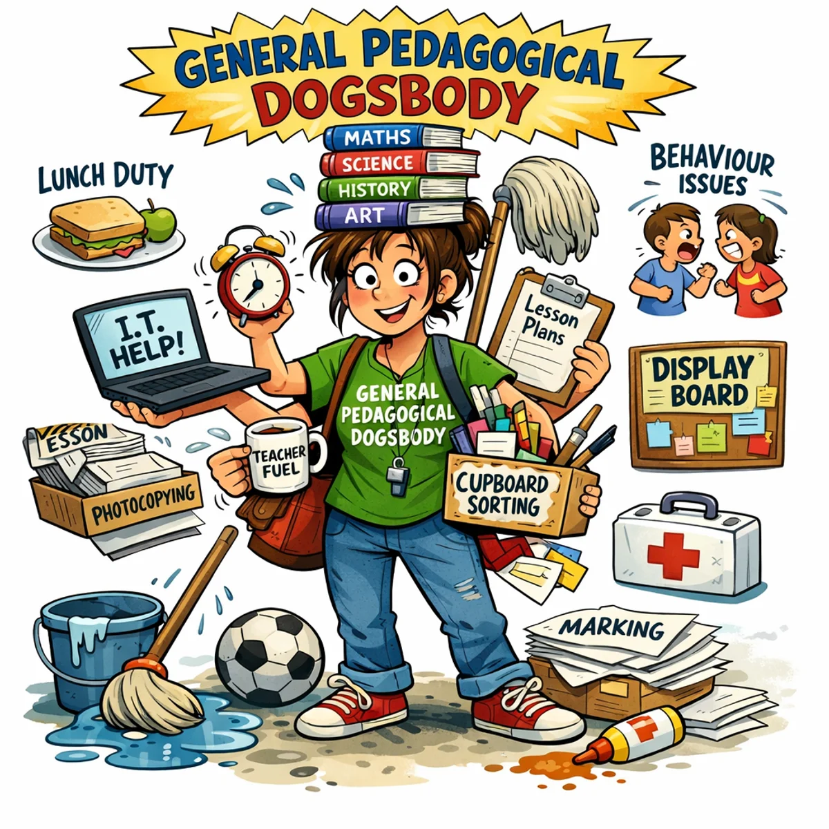
I opened Codex, attached the image, and asked it to break down the visual style and turn that into an image generation prompt.
The first result was decent but too locked to that specific image. It described the dogsbody character rather than the underlying style. So I asked Codex to step back and make something more reusable. Something where you drop in any phrase and get back an illustration that looks like it belongs to the same set.
After a few rounds, this is what we landed on:
Create a bright hand-drawn comic educational illustration for the phrase: "[KEY PHRASE]".

The image should explain the idea visually through a funny, memorable central character or scene. Use a clean white background, thick black ink outlines, expressive cartoon faces, playful proportions, saturated classroom-poster colors, soft marker-style shading, and a lively children's educational resource style.

Composition: one main central illustration, surrounded by small supporting visual details or mini-vignettes that represent related ideas, tasks, examples, causes, or consequences. Make it busy but readable, warm, humorous, and suitable for teachers and students.

Include simple banner space or label areas for short headings, but keep text minimal and very readable. Prioritize visual storytelling over written explanation.

Style rules: hand-drawn digital cartoon, bold outlines, colorful, energetic, educational, friendly, slightly chaotic, comic infographic, school worksheet illustration, poster-like layout.

Avoid: photorealism, 3D render, corporate vector art, minimalist icons, dark mood, cluttered unreadable text, tiny details, realistic anatomy.

Key phrase: "General Pedagogical Dogsbody"
Audience: teachers and school staff
Subject area: school life
Visual metaphor: an overworked but cheerful teaching assistant carrying dozens of school tasks at once
Must include: lunch duty, IT help, photocopying, marking, behaviour issues, lesson plans, display board, first aid, cleaning, stationery
Mood: humorous, warm, slightly chaotic
The top half is the style lock. Keep that the same every time. The bottom half, from Key phrase onwards, is where you put in your own concept, audience, and details. Swap those out and the style stays consistent.
What I found useful here is how specific the prompt is. It describes what you want, but the second part matters just as much: what to avoid. Without those guardrails, AI image tools tend to drift toward photorealism or corporate vector art, which is the opposite of what this style needs.
Three Tools, One Prompt
With the prompt ready, I wanted to see how different tools handled the same input. So I took it into Codex, Google Gemini, and Microsoft Copilot. No tweaks, same text, same phrase across all three.
 Codex working on it
Speed-wise, Gemini was fastest by a clear margin. Done in under a minute. Copilot wasn’t far behind. Codex took noticeably longer.

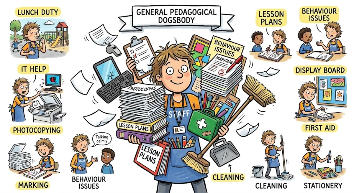
Codex was the slowest, but for me it was the strongest. It picked up on the hand-drawn quality in a way the others didn’t quite manage. It felt like something you’d actually use, rather than something that just looked generated.
A More Specific Ask
That first experiment was fairly contained. One phrase, one visual metaphor. I was curious how these tools handled something more demanding.
A colleague needed an image for a learning resource they were building. Not a mock-up or a graphic, but something photorealistic enough to pass as an actual Facebook screenshot. Here’s the prompt we put together:
Highly realistic screenshot of a Facebook post on a desktop browser.

Photorealistic, modern Facebook interface, clean white background, accurate Facebook fonts, spacing, icons and layout. The full Facebook post is visible with no cropping and clear borders.

The post includes: – A profile picture and name at the top – A short caption with emojis – A large photo underneath – Reaction icons with counts – Like, Comment, Share buttons – A comments section with several full comments visible

The photo in the post looks like a real personal photo, not staged: a casual smartphone photo of a laptop on a desk, natural daylight, warm tones, shallow depth of field, slight angle as if taken by hand, looks like something a real person would upload to Facebook.

On the laptop screen: a Microsoft Teams–style online lecture in progress, around 20 participants visible, the lecturer labelled clearly as "Michael T. (Lecturer)" with the camera on, two students with cameras on, all other participants have cameras off and show initials only.

The Teams chat panel is visible and shows only lecturer messages, with staggered timestamps and no replies:
09:12  Michael T. (Lecturer): Can anyone answer this question?
09:17  Michael T. (Lecturer): Please type in the chat if you're unsure.
09:26  Michael T. (Lecturer): Is my audio okay?
09:31  Michael T. (Lecturer): Are you all listening?

The Facebook post caption says: "Reality of online teaching."

Below the post are several fully visible Facebook comments in UK English:
– Hard to know what learners need when no one responds.
– What a boring session.
– I didn't understand anything.
– My internet was poor so I couldn't switch on the camera.

Ultra‑realistic, documentary style, looks like a real Facebook screenshot someone shared online, not a graphic, not a mock-up, no watermarks, no stylised UI, nothing exaggerated.
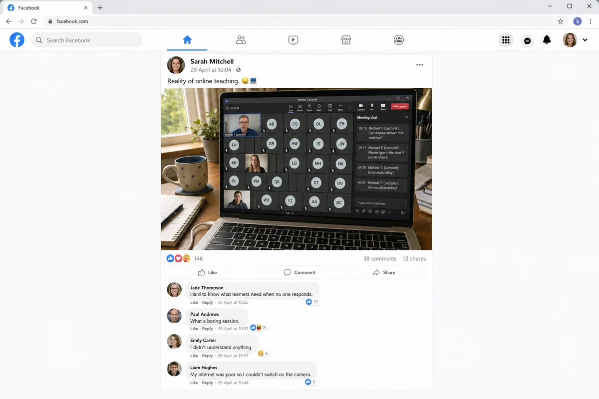
The level of detail genuinely surprised me. Getting the Teams interface right, the comment styling, even the caption tone. A year ago I wouldn’t have expected any of that to hold together.
What Comes Next
The most interesting thing to come out of this, for me, is the illustration prompt. I’d like to develop it into something more accessible, a simple tool where a colleague can type in a phrase and get back a consistent illustration without having to think about the prompt structure at all.
No idea if that’s a week’s work or a month’s work. We will see how it goes.
All of this started because I didn’t know what “dogsbody” meant. Funny how that works.